|
|
| y2j1999 |
I have 2 questions about the Rolling Stones and I hoped that somebody could answer them.
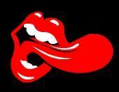
1.What does the tongue/lips logo mean?
2.What came first? The Rolling Stones or Rolling Stones Magazine? Did one of them name itself after the other? |
|
|
| F505 |
question 2: some years ago Mick Jagger told Jan Wenner from Rolling Stone: without us your magazine probably was named The Herman Hermit's Weekly. |
|
|
| scratched |

Welcome in! |
|
|
| Bloozehound |
 |
|
|
| Gazza |
The "lapping tongue" logo was designed by Andy Warhol, which therefore means that..it probably doesnt mean anything
(South American Cab driver : "What does BUTCH mean?"
Butch (Bruce Willis) : "I'm an American, honey. Our names don't mean shit"
"Pulp Fiction"
I'm sure someone could give you the exact details but its based on a Hindu goddess, Kali, or something. As for why its a lips and tongue...well, look at the lead singer!
The Stones formed in 1962 took their name from an old Muddy Waters song. Rolling Stone magazine didnt launch until 1967.
[Edited by Gazza] |
|
|
| scratched |
 
[Edited by scratched] |
|
|
| Bloozehound |
Andy Warhol did the toungue logo ? I thought someone else did it.
Yeah, I read it was originally based on a mix between the goddess Kali, who has a very distinctive tongue - long, protruding, flapping - and somehow Jaggers lips got thrown into the mix. Then they decided to make it more cartoonish in the end, instead of dark and sinister like.
(Ron Jermy) "Hey baby, you know what they call a "big whooper" in Amsterdam ?" (Bimbo)What? (Ron Jermy)Le Big Dick.(Bimbo)"I ain't ever been to France" (Ron Jermy) "Uhh, me either. Tell ya what, I'll take ya round the world on that big couch, whadda ya say eh ?"(Bimbo)"Ohhhh! I love the sound of Le Big Dicks with plenty of mayonnaise!" (Ron Jermy)I see London, I see France, I see your lacy underpants!"
Pulp Friction
[Edited by Bloozehound] |
|
|
| Gazza |
maybe youre right, I cant honsetly remember (the Warhol bit I mean, not the Ron jeremy bit)
Warhol designed the Sticky Fingers sleeve. Maybe thats what I was thinking of.
|
|
|
| parmeda |
y2j1999...first, welcome!
Hope this answers your 1st question. It's been a tossed around subject for some time. And Gazza gave you an accurate account on your 2nd one...
******************************************************
Tuesday, February 19, 2002
Copyright © Las Vegas Review-Journal
It's only rock 'n' roll
Ruby Mazur wants to be known for more than Rolling Stones logo he created

By JOHN PRZYBYS
REVIEW-JOURNAL
Ruby Mazur is talking with a visitor about his career as an album designer, artist and illustrator when the phone rings. It's his manager, calling from New York.
"We're just doing a thing about guess what?" Mazur says, smiling delightedly at the coincidence. "The mouth and tongue."
Then Mazur laughs, raises his voice in mock pained frustration, and yells into the phone, "And I don't want to talk about it anymore!"
Such is life when an artist's résumé includes creating at least one version of what is probably the most recognizable logo in rock 'n' roll: the Rolling Stones' classic lips-and-tongue emblem.
Mazur designed one of the earliest versions of the logo -- maybe the earliest, although that's where things become a bit hazy -- for the Stones' "Tumbling Dice" single in 1972.
Actually, though, the lips-and-tongue logo is only one tiny part of the career Mazur, 55, has forged during the past 35 years, bits and pieces of which can be found on the walls of the Las Vegas apartment Mazur shares with Zeus and Lucy, his very friendly, very large dogs.
There also are photos of Mazur with Billy Joel, Dennis Hopper, Alice Cooper, Whoopi Goldberg, Harrison Ford and other celebrities. There are announcements of past shows. There's a letter congratulating him for an early-career Grammy nomination and a shadowbox-mounted illustration of the Stones logo.
And, of course, there are dozens of his paintings either hanging on the wall or sitting on the floor.
For the Brooklyn-born and Long Island-raised former New Yorker, art has been a passion since the age of 5.
"I was always bored," Mazur recalls. "So my mother would tell my father, `Just give him a pencil and teach him how to draw a glass.' So I had a million glass drawings on my fridge."
By the time high school rolled around, Mazur had "just totally dedicated myself to art."
After high school, and an initial rejection for low grades, Mazur was accepted into art school in Philadelphia. On weekends, he would return home to New York, where his father owned a nightclub. Mazur says he and his brother signed groups to play in the club, and even managed a few bands themselves.
After art school, Mazur's interests in music and art meshed nicely when he learned Paramount Records was searching for an art director. With youthful boldness, Mazur says he bluffed his way into the job.
"I didn't even know the size of an album cover," Mazur says, laughing. "But I went to the printer and I asked a million questions, and by (the next day) I was designing album covers."
Mazur's timing turned out to be perfect. By 1971, record album covers had become a form of alternative art unbounded by convention.
As an artist, Mazur says, "you just let your mind go, and the more insane of an idea, the better it was."
"There was freedom of thinking and of expression. And kids back then who went into a record store looked through the racks. You could have an album nobody heard of, but if it looked cool they'd buy it."
After a year at Paramount, Mazur opened his own design studio in New York and eventually opened satellite offices in London and Los Angeles.
Mazur says he designed more than 3,000 album covers during a period of about 10 years for artists ranging from Roy Clark to Joe Walsh and for genres ranging from jazz to pop to soundtracks.
But Mazur's most famous cover came early in his career, when, he says, Mick Jagger himself asked Mazur to design a cover for "Tumbling Dice."
"First, I started thinking about doing a thing with the English flag," Mazur says. "Then I just kept thinking about the music and the whole attitude, the whole sex thing, and those lips (of Jagger's) really jumped out at you.
"Then I started doing a caricature of him, and that didn't work. Then, I just zeroed in on the mouth and tongue and it worked."
However, Mazur's design isn't the one that's most familiar to music fans. Mazur's logo features a stylized lips and tongue, but also includes two eyes as a sort of stylized representation of Jagger's face.
The most commonly seen version of the logo, and the one used the most by the band itself, features only lips and a tongue. And that variance has created confusion through the years about the logo's lineage.
Mazur says he's seen the logo erroneously credited to Andy Warhol. One online source cites Billboard magazine as attributing the original logo to artist John Pasch and its first officially used variation to Mazur.
Mazur disagrees. Pasch, he says, "did a derivative of mine."
Mazur's recollection is that his logo predated Pasch's, and, as far as he knows, his design for the single was the band's first use of the logo.
Still, the father of four says, "honestly, I swear on my children's lives, I don't know who came first. I don't ever remember them giving me a logo with a mouth and tongue, saying, `Do a variation on this.' But, then again, I couldn't swear to it. It was so like in the same minute."
Nonetheless, the logo's tangled history has been a source of alternating bemusement and frustration for Mazur through the years. A few years ago, a New York newspaper story about a Mazur art show noted the artist's association with the logo, but ran the wrong logo with the story.
"I even saw on one of those `Rock & Roll Jeopardy!' things (the question), `Who did the (logo),' " Mazur says. "They said Andy Warhol and that was the wrong answer."
How did Mazur react?
"I threw a beer can at it," he answers, laughing heartily.
On the other hand, Mazur saw another quiz show that gave him credit for the logo.
"Hey, 50-50, I'll take it," he says, smiling.
Mazur's relative equanimity stems from the fact the logo represents only one, and one very early, aspect of his career. In fact, he left the album design business in the early '80s, "as soon as CDs came in," he says. "The fun was over."
Mazur spent a few years doing illustration work for books, magazines, ads, TV and film projects, then decided to work for himself. He worked first in a genre called abstract illusionism, in which surrealistic designs are given depth so as to appear, he says, as if "the paint was floating off the canvas."
Mazur did what he calls his "Squigglies" series, featuring rounded, snakelike forms cavorting on surrealistic backgrounds, and, in 1985, had his first show in New York City.
"(About) 1,500 people showed up and there was major press, and not one piece was sold," he says. "Not one. The next day I was so depressed."
Mazur's brother conducted the post-mortem. He said, Mazur recalls, that "people just don't get what you're trying to do. If you really want to be an artiste, keep making `Squigglies' and don't eat. Or, get off of it and paint something people will buy."
"It was hard to hear, but only your brother could tell you that. That's when I re-evaluated and said, `Know what? It was ahead of its time.' "
A new theme came from a friend who'd just gotten a sales job with a cigar magazine. The friend, Mazur says, suggested Mazur have the model he was painting hold a cigar.
Mazur gave it a shot. And, he says, the painting sold for $25,000 two days later.
So, Mazur says, laughing, "I started my cigar art collection," a whimsical series featuring cigars as elements of iconic images or classic scenes: a smiley face smoking a cigar, the Statue of Liberty smoking a cigar, the woman in "American Gothic" smoking a cigar, even his own Rolling Stones logo smoking a cigar.
About six years ago, Mazur also began painting a series featuring female celebrities -- Calista Flockhart, Claudia Schiffer -- re-imagined as wild animals. Most recently, Mazur has spent much of his time doing commissioned works of people's pets.
"It's a huge hit," says Mazur, "and oddly enough, 9-11 has a lot to do with it. People are retreating back to family, and pets are like kids to people."
The paintings range in price from $5,000 to $10,000 and beyond, and Mazur -- himself a serious dog lover -- clearly enjoys doing them.
"I'm doing it as an art form and not cheapie paintings," he says. "If you look at the paintings I've done, they're really good paintings."
Mazur moved to Las Vegas two years ago with plans to open a gallery featuring artwork created by rock stars, actors, actresses and other celebrity friends. While an initial effort fell through, the gallery is still one of his goals.
"I have 40 celebrities who want to exhibit in my gallery," Mazur says. "Musicians and actors respect me for being an artist. I'm not just a corporation."
While he doesn't currently show his work in valley galleries, his art is available on his Web site (www.rubymazur.com). Soon, he hopes to add a line of original apparel and collectibles featuring his mouth-and-tongue logo.
Still, Mazur admits he's a bit weary of still having to talk about what may be his most well-known work.
"I'm so sick and tired of hearing about it," he says, shaking his head. "It's like 30 years ago. But you know what? I wouldn't have gotten anyplace if I didn't do that."
*******************************************************
I also have this trivial fact taken from my pile-o-stuff...
"The famous tongue and lip design and countless variations of such has graced countless official and unofficial Rolling Stones memorabilia and products since it first appeared when the band formed "Rolling Stones Records" in 1971. Credit for the creation of the original design has been mistakenly given to several people over the years. Many have stated that Andy Warhol was the originator. He did design two album covers for the band, but not the tongue design. In 1995, Billboard Magazine printed that it was from the mind of Ruby Mazur. Discovering their mistake, they later corrected their statement, identifying Mazur as the designer of the first official variation of the tongue design. With further research later that year, Billboard definitely uncovered that the original classic design came from John Pasch. Two years later, Mick Jagger confirmed that Pasch was the originator of the fabled logo."
********************************************************
There was another name that I've heard tossed around...Craig Braun. (Sorry, can't seem to find much of his story...but give me, or someone else, some time to dig it up)
WHO KNOWS!!!
Maybe on Mick's deathbed (God forbid!), he may reveal the truth, lol...
[Edited by parmeda] |
|
|
| Monkey Woman |
quote:
parmeda wrote:
[...]
Mazur designed one of the earliest versions of the logo -- maybe the earliest, although that's where things become a bit hazy -- for the Stones' "Tumbling Dice" single in 1972.
[...]
"The famous tongue and lip design and countless variations of such has graced countless official and unofficial Rolling Stones memorabilia and products since it first appeared when the band formed "Rolling Stones Records" in 1971. Credit for the creation of the original design has been mistakenly given to several people over the years. Many have stated that Andy Warhol was the originator. He did design two album covers for the band, but not the tongue design. In 1995, Billboard Magazine printed that it was from the mind of Ruby Mazur. Discovering their mistake, they later corrected their statement, identifying Mazur as the designer of the first official variation of the tongue design. With further research later that year, Billboard definitely uncovered that the original classic design came from John Pasch. Two years later, Mick Jagger confirmed that Pasch was the originator of the fabled logo."
John Pasche seems the best candidate. The 1st release on Rolling Stones Records was in April 1971 (Brown Sugar) and had the tongue logo on it. So did the album Sticky Fingers, with its infamous zipper cover designed by Warhol. But it was just a little logo on the back cover and the record sticker, near the copyright and credits.
Tumbling Dice, with the design by Mazur, was released one year after in April 1972. I think it was the time when the Stones began to use the logo more and more for publicity purposes: the logo is painted on the tour plane, on t-shirts (there are pics of Keith and Charlie with tongue t-shirts during the 1972 tour). But it's always the "classic" tongue, the one designed by Pasche, not the Mazur version.
About the "meaning": Mick and Keith say they saw in an Indian restaurant (!) around 1968 a picture of the Hindu death goddess Kali, classically represented with a lolling tongue and a necklace of skulls. She's dancing extatically while trampling dead ennemies. So Mick said he commisionned the artist John Pasche to do a logo using the disembodied mouth and tongue. He wanted it easily recognizable, in the style of Warhol's pop art. Pasche also said he took inspiration in Mick's tongue and lips (where else!) in his design, wanting to update and make more sexy the old symbol. Not a bad idea.
End note: he was paid $50 for the design but got later a $200 bonus. Talk about getting something cheap!  |
|

 CHAT
ROOM aka THE FUN HOUSE] [
CHAT
ROOM aka THE FUN HOUSE] [ RESTROOMS]